Design Systems
Components, tokens and rules kept as one source that design and code both read from — so the tenth screen doesn't drift from the first.
Be part of usOur industriesOur services
Design that survives contact with engineering. Our UX/UI design services sit inside a development team — screens get drawn next to the people who have to build them, not handed over a wall.





What we design, and what you get at the end of it — research, wireframes, a design system and files a developer can build from, not a presentation.
Components, tokens and rules kept as one source that design and code both read from — so the tenth screen doesn't drift from the first.
A review of a product you already have — where users drop out, what's inconsistent, and which fixes are worth doing first. Ranked by cost, not by taste.
iOS and Android patterns rather than a web layout shrunk down — navigation, gestures and touch targets that match what the platform taught your users.
Files that come with the specs an engineer actually needs — spacing, states, breakpoints, and a person to ask. Usually that person is on the same team.
The whole surface of a product — navigation, states, empty screens, errors. The parts that decide whether someone finishes a task, not just the marketing shots.
Interviews, session recordings and a look at what your users actually do — enough to make decisions, not a hundred-page report nobody reads.
Structure before pixels. A clickable prototype you can put in front of someone and get a reaction before anything gets built.
High-fidelity screens with real content and real edge cases — long names, empty lists, error states, the things that break a layout in production.
Components, tokens and rules kept as one source that design and code both read from — so the tenth screen doesn't drift from the first.
A review of a product you already have — where users drop out, what's inconsistent, and which fixes are worth doing first. Ranked by cost, not by taste.
iOS and Android patterns rather than a web layout shrunk down — navigation, gestures and touch targets that match what the platform taught your users.
Files that come with the specs an engineer actually needs — spacing, states, breakpoints, and a person to ask. Usually that person is on the same team.
The whole surface of a product — navigation, states, empty screens, errors. The parts that decide whether someone finishes a task, not just the marketing shots.
Interviews, session recordings and a look at what your users actually do — enough to make decisions, not a hundred-page report nobody reads.
Structure before pixels. A clickable prototype you can put in front of someone and get a reaction before anything gets built.
High-fidelity screens with real content and real edge cases — long names, empty lists, error states, the things that break a layout in production.
Five steps, and a working screen you can click at the end of the second one — not at the end of the project.

We look at the product, the users and the constraints — including the technical ones, since we'll be building this too.

Structure first: the screens, the paths between them, and a clickable prototype you can test on someone before we style it.

Visual design applied to the real flows, with the states and edge cases that only show up once there's actual content.

Components and tokens extracted from the screens, so the next feature is assembled rather than redrawn.

We stay through implementation — reviewing the built screens against the design, and answering the questions a file can't.
We look at the product, the users and the constraints — including the technical ones, since we'll be building this too.
Structure first: the screens, the paths between them, and a clickable prototype you can test on someone before we style it.
Visual design applied to the real flows, with the states and edge cases that only show up once there's actual content.
Components and tokens extracted from the screens, so the next feature is assembled rather than redrawn.
We stay through implementation — reviewing the built screens against the design, and answering the questions a file can't.
Design is easy to buy and hard to land. Most of what goes wrong happens after the files are delivered.

You react to something real early, while changing it is still cheap. Long silent design phases are where budgets and timelines go.
Engineers see the flows while they're being drawn. You don't pay for screens that turn out to be impossible, or get quietly simplified during the build.
The design system isn't a deliverable we hand over — it's what the next screen is assembled from. The library grows as the product does.
When there's disagreement about a screen, we put it in front of five people instead of arguing. It settles faster and the answer holds.
No gap between two vendors blaming each other — one scope, one timeline, and the same people answering for the result.

We agree what the design is supposed to change — signups, task completion, support tickets — before it's drawn. Then you can check.
Design is easy to buy and hard to land. Most of what goes wrong happens after the files are delivered.
You react to something real early, while changing it is still cheap. Long silent design phases are where budgets and timelines go.
Engineers see the flows while they're being drawn. You don't pay for screens that turn out to be impossible, or get quietly simplified during the build.
The design system isn't a deliverable we hand over — it's what the next screen is assembled from. The library grows as the product does.
When there's disagreement about a screen, we put it in front of five people instead of arguing. It settles faster and the answer holds.
No gap between two vendors blaming each other — one scope, one timeline, and the same people answering for the result.
We agree what the design is supposed to change — signups, task completion, support tickets — before it's drawn. Then you can check.
Design is easy to buy and hard to land. Most of what goes wrong happens after the files are delivered.
You react to something real early, while changing it is still cheap. Long silent design phases are where budgets and timelines go.
Engineers see the flows while they're being drawn. You don't pay for screens that turn out to be impossible, or get quietly simplified during the build.
The design system isn't a deliverable we hand over — it's what the next screen is assembled from. The library grows as the product does.
When there's disagreement about a screen, we put it in front of five people instead of arguing. It settles faster and the answer holds.
No gap between two vendors blaming each other — one scope, one timeline, and the same people answering for the result.
We agree what the design is supposed to change — signups, task completion, support tickets — before it's drawn. Then you can check.
A selection of the custom software we've built across industries — different products, different scales, one standard of work.
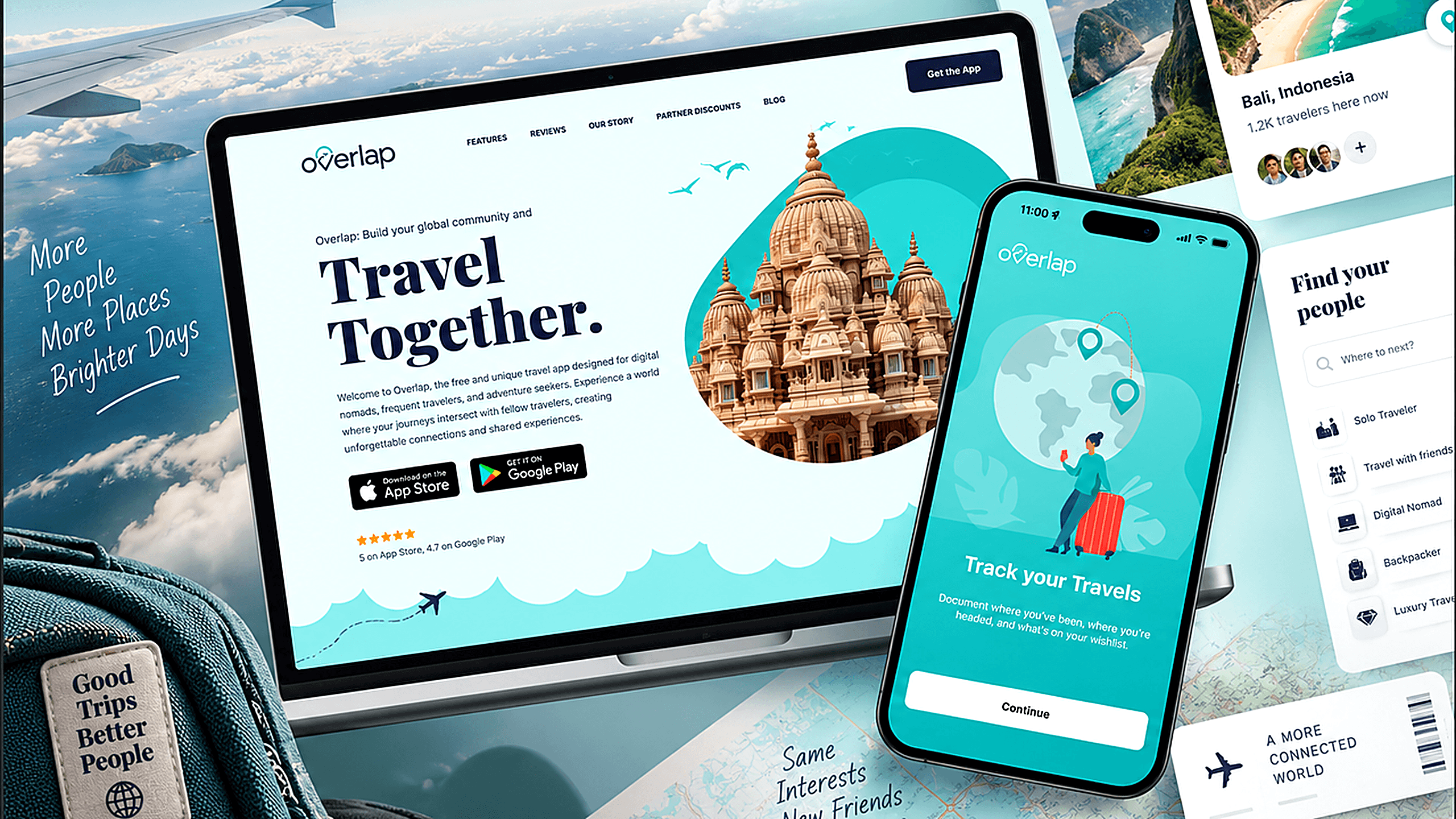
Social travel app that alerts digital nomads and frequent travelers when their plans overlap with friends and like-minded people on the road
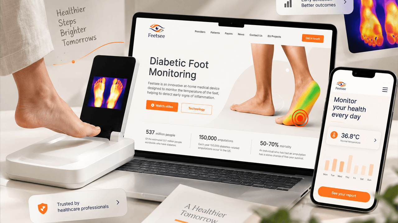
Built an intuitive and reliable digital experience for a medical device that helps detect early signs of foot inflammation and prevent diabetes-related complications
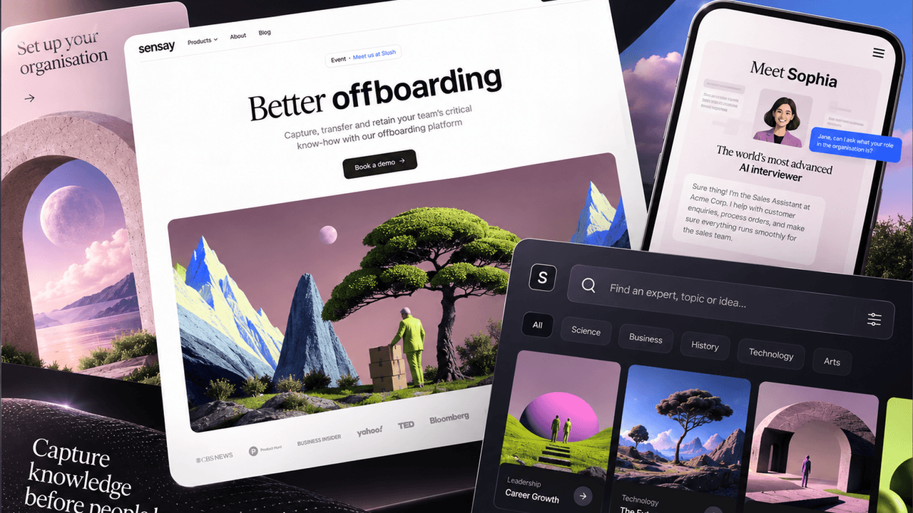
AI-powered chatbot search for a growing library of AI personas — helping users find and start a conversation with the right expert, celebrity, or historical figure in seconds
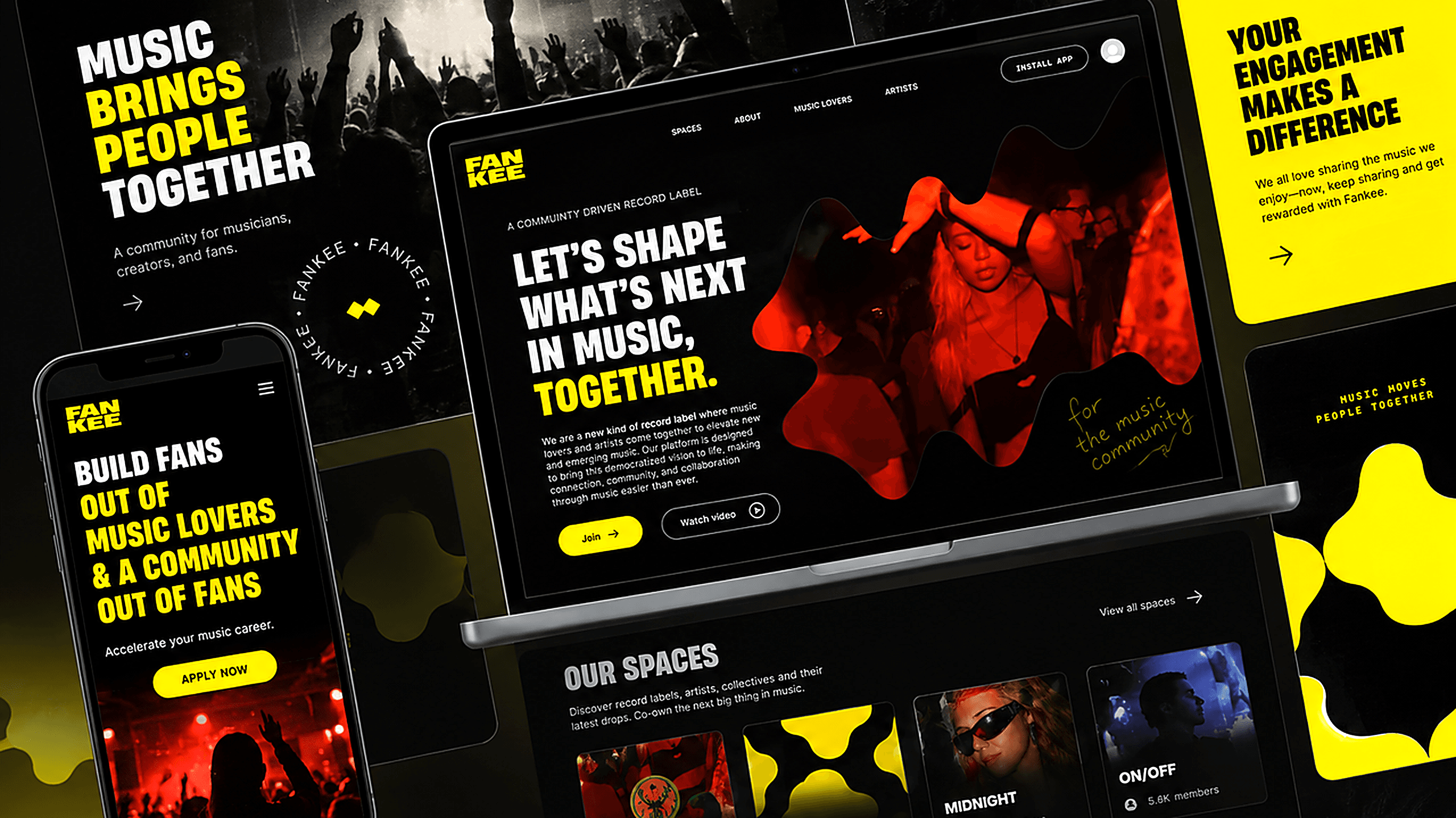
Web platform where music fans stream, share, and earn real ownership in the tracks by the artists they support
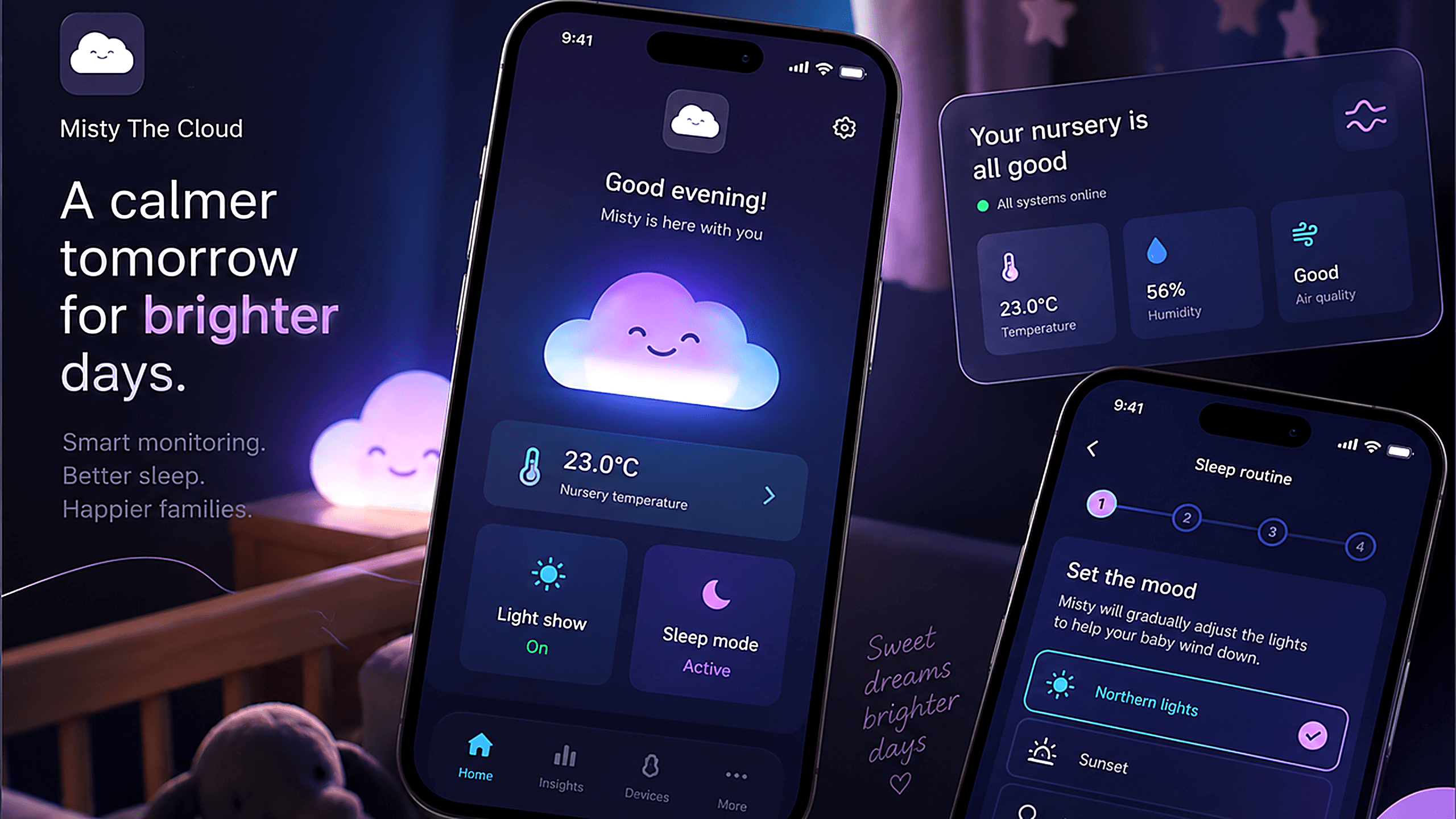
Companion mobile app for Misty the Cloud, a smart nursery night light — giving parents remote control over temperature alerts, sleep training, and light shows from their phone
Social travel app that alerts digital nomads and frequent travelers when their plans overlap with friends and like-minded people on the road
Built an intuitive and reliable digital experience for a medical device that helps detect early signs of foot inflammation and prevent diabetes-related complications
AI-powered chatbot search for a growing library of AI personas — helping users find and start a conversation with the right expert, celebrity, or historical figure in seconds
Web platform where music fans stream, share, and earn real ownership in the tracks by the artists they support
A selection of the custom software we've built across industries — different products, different scales, one standard of work.
Built an intuitive and reliable digital experience for a medical device that helps detect early signs of foot inflammation and prevent diabetes-related complications
AI-powered chatbot search for a growing library of AI personas — helping users find and start a conversation with the right expert, celebrity, or historical figure in seconds
Web platform where music fans stream, share, and earn real ownership in the tracks by the artists they support
Companion mobile app for Misty the Cloud, a smart nursery night light — giving parents remote control over temperature alerts, sleep training, and light shows from their phone
Social travel app that alerts digital nomads and frequent travelers when their plans overlap with friends and like-minded people on the road
Built an intuitive and reliable digital experience for a medical device that helps detect early signs of foot inflammation and prevent diabetes-related complications
AI-powered chatbot search for a growing library of AI personas — helping users find and start a conversation with the right expert, celebrity, or historical figure in seconds
A selection of the custom software we've built across industries — different products, different scales, one standard of work.
Built an intuitive and reliable digital experience for a medical device that helps detect early signs of foot inflammation and prevent diabetes-related complications
AI-powered chatbot search for a growing library of AI personas — helping users find and start a conversation with the right expert, celebrity, or historical figure in seconds
Web platform where music fans stream, share, and earn real ownership in the tracks by the artists they support
Companion mobile app for Misty the Cloud, a smart nursery night light — giving parents remote control over temperature alerts, sleep training, and light shows from their phone
Social travel app that alerts digital nomads and frequent travelers when their plans overlap with friends and like-minded people on the road
Built an intuitive and reliable digital experience for a medical device that helps detect early signs of foot inflammation and prevent diabetes-related complications
AI-powered chatbot search for a growing library of AI personas — helping users find and start a conversation with the right expert, celebrity, or historical figure in seconds
The design tools are the boring part. What matters is that the same file goes straight into the front-end stack below it.


The design tools are the boring part. What matters is that the same file goes straight into the front-end stack below it.
The design tools are the boring part. What matters is that the same file goes straight into the front-end stack below it.
The interface problem is different in each of these — who the user is, how much time they have, and what happens when they get it wrong.
Browsing is the product. Getting someone from open to playing in a few taps beats any amount of visual polish on the way.
Checkout, filters and search carry the revenue. We design them against real catalogues, not a demo with twelve perfect products.
People use these screens all day and can't opt out. Speed of repeated actions beats first impressions — keyboard paths, bulk edits, defaults.
The interface stands between a person and physical hardware. Status has to be readable in a second, and irreversible actions need a way back.
Clinicians read screens between patients, often on a shared device. Density, defaults and confirmations matter more than aesthetics.
The design job is the second week, not the first. Onboarding is easy; keeping someone opening the app after the novelty is the hard part.
Browsing is the product. Getting someone from open to playing in a few taps beats any amount of visual polish on the way.
Checkout, filters and search carry the revenue. We design them against real catalogues, not a demo with twelve perfect products.
People use these screens all day and can't opt out. Speed of repeated actions beats first impressions — keyboard paths, bulk edits, defaults.
The interface stands between a person and physical hardware. Status has to be readable in a second, and irreversible actions need a way back.
Clinicians read screens between patients, often on a shared device. Density, defaults and confirmations matter more than aesthetics.
The design job is the second week, not the first. Onboarding is easy; keeping someone opening the app after the novelty is the hard part.
Browsing is the product. Getting someone from open to playing in a few taps beats any amount of visual polish on the way.
Checkout, filters and search carry the revenue. We design them against real catalogues, not a demo with twelve perfect products.
What people ask before hiring a designer they'll have to work with for months.
A design system is the set of components, tokens and rules that screens get assembled from, kept in one place so design and code agree. You need one once the product has more than a handful of screens, or more than one person touching it. Below that it's overhead.
What people ask before hiring a designer they'll have to work with for months.
A design system is the set of components, tokens and rules that screens get assembled from, kept in one place so design and code agree. You need one once the product has more than a handful of screens, or more than one person touching it. Below that it's overhead.
Send us what you have — a brief, a sketch, or just the problem you're trying to solve. You'll get a reply within one business day.

fixit.soft@fixit-soft.com

+380 93 023 42 28